graphicore Bitmap Font Building—updated
...............................###.....##......................... ......##......................###......##......................... .....###......................##.................................. ..####..###.##..##.##.##.###..#####..###...###...####.###.##..###. .##.###..##.##.##.###..##.###.###.##..##..##.##.##.###.##.##.##.## ##...##..###..##...##..##..##.##..##..##.##....##...##.###..#####. ###.##...##...##...##..##..##.##..##..##.##....##...##.##...##.... .######..##...###.###..##.##..##..##..##.###.#.###.##..##...##..#. .....###.##....###.###.####...##..###.###.####..####...##....####. ##....##...............##......................................... ###..##................##......................................... .#####.................##.........................................
graphicore Bitmap Font
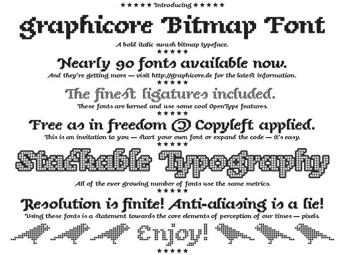
is a bitmap typeface that was early inspired by Underwares Sauna bold italic swash and eventually went on its own way. It’s crisp on the screen at a size of 8 px and multiples thereof. However the intended use case lies rather in display sizes. Using these fonts is a statement towards the core elements of perception of our times—pixels. Resolution is finite. Anti-aliasing is a lie!
The typeface itself is defined in a custom format where the glyphs are stored in text-files idiomatically as bitmaps. Like in the ASCII art above a dot stands for “no pixel” and the number sign marks the opposite. This is what I believe a bitmap font should be like—made out of bitmaps. Character editing was done in a simple text editor program.
graphicore Bitmap Font Building
The fonts I make available here are build from a custom format “Bitmap Font” (BMF) into ready to use OpenType format by a Python program: “graphicore Bimap Font Building” (graphicoreBMFB). By using different parameters varying fonts are generated. The font files released here are thus a demonstration of the output of graphicoreBMFB. When the possibilities of graphicoreBMFB get more comprehensive the graphicore Bitmap Font family will eventually grow.
Attached to the program is the source data of graphicore Bitmap Font in the BMF format. This opens following chances to you:
- You can generate your own fonts if you don’t like the settings I chose.
- You can study it as a working example and learn how to make your own typeface design.
- You can write your own generator and built the typeface with that.
- You can give your enhancements back to the world.
What to Do
Download the Fonts
Download the fonts package and enjoy writing with them:
graphicoreBitmapFont.tar.bz2
graphicoreBitmapFont.zip
all downloads
Obtain the Code
Have an eye on the code and then make everything better and more—or just use it: graphicoreBMFB. It’s written in Python and uses the great FontForge Python module to create outline fonts. You’ll need that, too.
Join Me
If you like this project or if the ideas keep on bubbling up from your subconsciousness leave me a message. If there’s enough interest in cooperation I’ll set up a central site for that.
Get Serious
If you need a custom typeface or special format that makes reading on your special matrix of special things pleasing, I’m your guy. Furthermore I’m good in internet issues and printed matter. If you value my work we might fit together. Leave me a message.
All Currently Contained Glyphs in the Typeface.
| ! | " | # | $ | % | & | ' | ( | ) | * | + | , | - | . | / | 0 |
| 1 | 2 | 3 | 4 | 5 | 6 | 7 | 8 | 9 | : | ; | < | = | > | ? | @ |
| A | B | C | D | E | F | G | H | I | J | K | L | M | N | O | P |
| Q | R | S | T | U | V | W | X | Y | Z | [ | \ | ] | ^ | _ | ` |
| a | b | c | d | e | f | g | h | i | j | k | l | m | n | o | p |
| q | r | s | t | u | v | w | x | y | z | { | | | } | ~ | ¡ | ¢ |
| £ | ¤ | ¥ | ¦ | § | ¨ | © | ª | « | ¬ | ® | ¯ | ° | ± | ² | ³ |
| ´ | µ | ¶ | · | ¸ | ¹ | º | » | ¼ | ½ | ¾ | ¿ | À | Á | Â | Ã |
| Ä | Å | Æ | Ç | È | É | Ê | Ë | Ì | Í | Î | Ï | Ð | Ñ | Ò | Ó |
| Ô | Õ | Ö | × | Ø | Ù | Ú | Û | Ü | Ý | Þ | ß | à | á | â | ã |
| ä | å | æ | ç | è | é | ê | ë | ì | í | î | ï | ð | ñ | ò | ó |
| ô | õ | ö | ÷ | ø | ù | ú | û | ü | ý | þ | ÿ | ı | – | — | ‘ |
| ’ | ‚ | “ | ” | „ | … | ‹ | › | ⁰ | ⁴ | ⁵ | ⁶ | ⁷ | ⁸ | ⁹ | € |
| ℡ | ™ | ★ | ✉ | | | | | | | | | | | | |
| | | | | ff | fi | ffi | st |
The Styles and the Names
Each family of the graphicore Bitmap Font has its own characteristics. Because there is no system in the development of these characteristics I decided to number them—of course, I started counting at zero. Furthermore, it is easy to add new variants to the collection when new generators evolve. The drawback is that the name doesn’t describe what the font looks like.
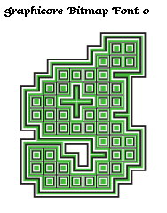
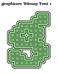
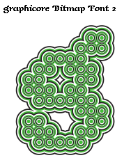
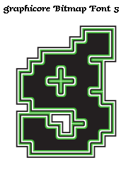
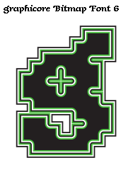
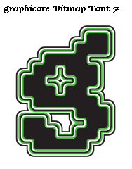
The styles differ in their corner radius and where the corners are rounded. In the first three families all corners of each “pixel” are handled the same. The corner radius of the third family makes the pixels to circles and the family therefore to a “dot matrix”.
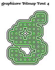
In the latter styles an algorithm decides where to draw rounded cornes. Number Three and Four have rounded corners where they should be. Five and Six add corners outside of the pixels, where actually is no content in the matrix. Seven and Eight got “outer” and “inner” rounded corners.


The Weights
I did twelve different weights for each family. Weight means that the aperture of the pixel-elements differs between the fonts, while the center doesn’t move.
Within the range of Thin to Regular the underlying grid becomes clearly visible, because of the gap that emerges between the items. Medium is the weight where the elements match exactly the grids width. The weights beyond Medium grow above the boundaries of the grid units and make the font bold. Finally, with Extra-Black, one pixel is more than double of the size of a grid unit and Ultra-Black goes even one step further. The families with “outer” rounded corners initially receive no weights lighter than Medium, because I’m not pleased with the outcome now.
To write on a screen at 8 px the Regular or the Book fonts are best suited, because the pixels are a little bit smaller than a grid unit thus preventing rounding errors. Medium should as well work good and be crisp. The bolder weights have their use cases at display sizes.
All-in-One
Because it looks so great I stacked all the fonts of a family combined on a pile. The bolder fonts become the outlines of lighter ones, that creates an All-in-One family overview.


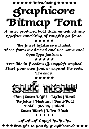
The Missing Type Specimens
Sometimes a simple type specimen is needed. Here are two in different sizes. There’s a PDF for the bigger specimen where you can zoom in and study the details.
All examples on this page are available as high quality PDF, SVG and PNG in the “media”-folder of the font package. The contents of the “media”-folder in the font-package and this text are available under the Creative Commons Attribution 3.0 Unported License.